An "accordion" is an excellent way to display specific content only upon user request and to create a clear page layout. In this article, we will show you how to use accordions in Sitejet Builder.
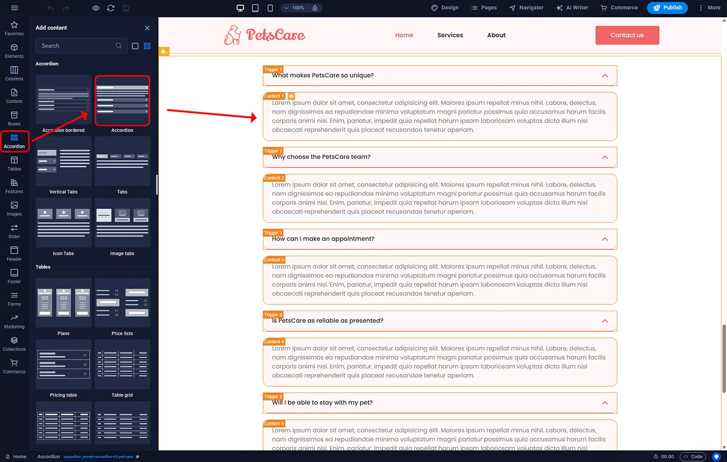
To add an "accordion" to your page, click the Accordion icon in the left sidebar and drag this element to the desired location.
Sitejet Builder - accordion
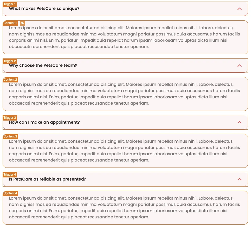
The accordion added in the page editor consists of a button (trigger) and content.
Sitejet Builder - accordion
The trigger is the accordion button containing a header. Headers, like other elements, can serve as links to websites, files, or other elements – in this case, to the accordion's content. You can customise the trigger by changing the settings in the left panel after double-clicking it.
The content is the main body of our accordion. It can contain any type of content. By default, there is text there, but it is possible to insert any element in this space, such as an image or video.
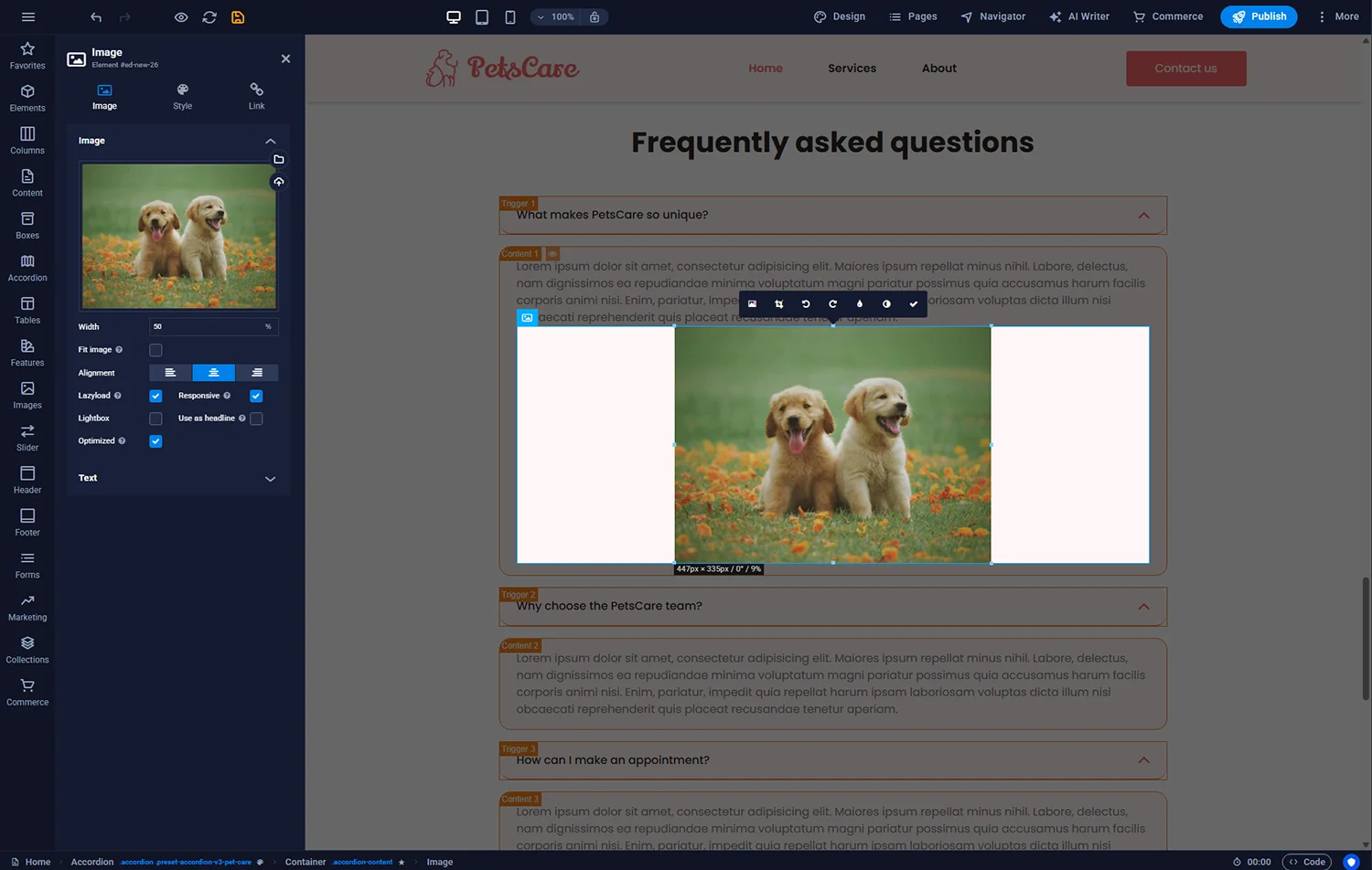
Sitejet Builder - additional element in the accordion content
For this accordion's content to be visible when the button is clicked, an animation is required. Since this is a ready-made template, the animation has already been added to the container element. However, you can change its settings, such as the opening method or speed. Elements with animations are marked with a star icon before their name in the breadcrumb trail at the bottom.

Sitejet Builder - accordion animation
After customising the accordion to your needs, you can activate the preview by clicking the eye icon on the top bar.
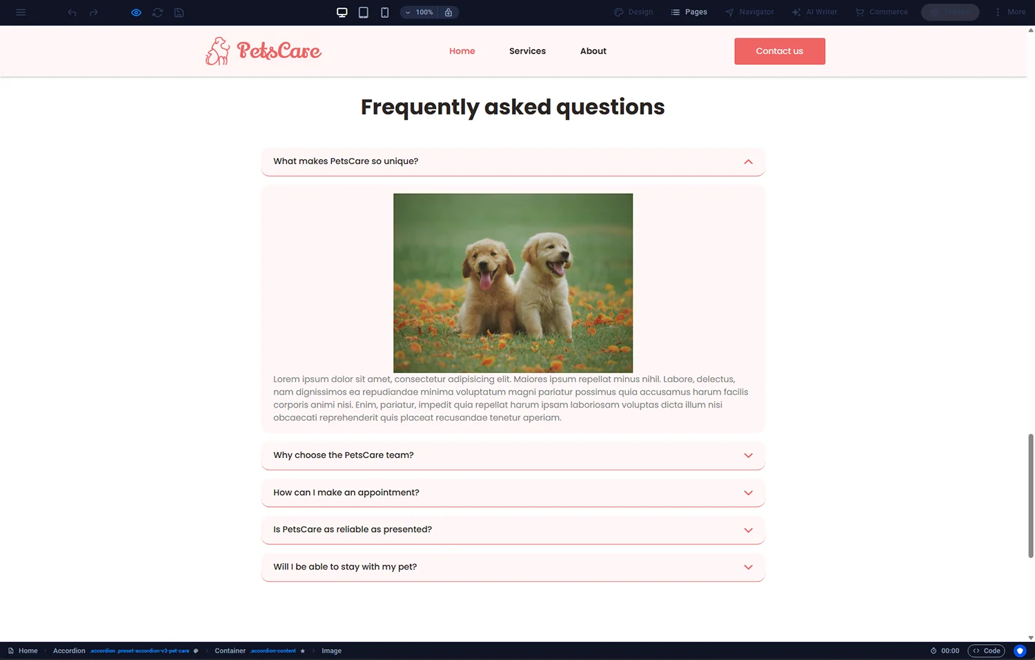
Sitejet Builder - accordion preview
Tip: By default, the accordion settings cause the content of the first element to be visible. If you want it to be hidden and only appear after clicking, go to the animation settings of this container and select Hidden Element in the Initial option.
You can use various components to expand the accordion content. Instead of a header, you can also use an image. In this case, Image Tabs would be a useful element to add to your page.
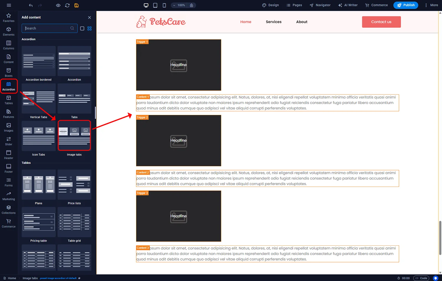
Sitejet Builder - image tabs
After adding the Image Tabs element to the page, the editor will look as follows:
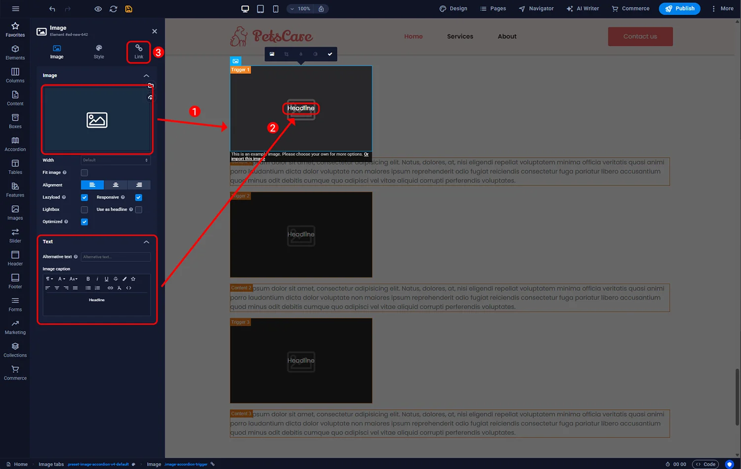
Sitejet Builder - Image tabs - settings
1 - In this example the image serves as the accordion button. Use the File Manager to select an image or upload your own file.
2 - To add text on the image, edit the Image Title in the Text section.
3 - In the Link section, you can link the button to any element – another page, an external source, or a specific component. For accordions, the Next Element option is the most useful – which is why it is selected by default. This will link the button to the next element or container in the editor (in our case – to the content field).
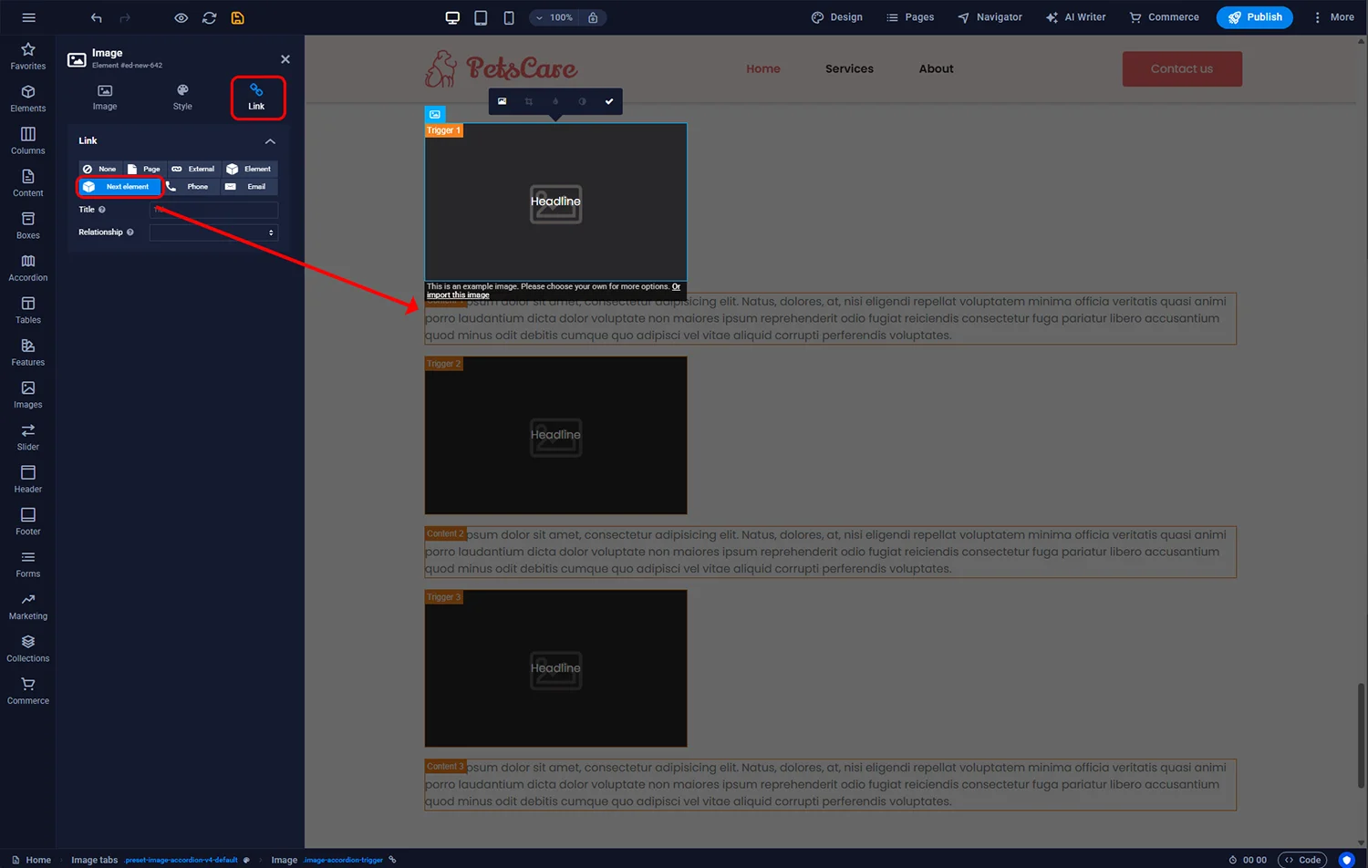
Sitejet Builder - Image tabs - link
To add further accordion items, you can:
Important note regarding copying accordion elements: always check that the Trigger and its corresponding content remain stacked one below the other. Otherwise, the Next Element linking mechanism will not work correctly.
© 2026 Smartx Technologies LTD. All rights reserved.